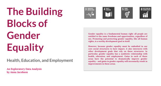
“What would it mean to do feminist data science?” This question, raised by a fellow MIDS classmate, sparked the idea for Anna Jacobson’s award-winning data visualization “The Building Blocks of Gender Equality.”
Jacobson is one of one of five winners of Google Cloud’s Visualize 2030 contest. The contest asks students to analyze datasets from the World Bank and the United Nations Statistics Division, visualize that data using Google Data Studio, and ultimately tell a data story about how at least two of the UN’s 17 Sustainable Development Goals (SDGs) influence each other and how to achieve them by 2030.
Throughout her time in the Master of Information and Data Science program, in the midst of what she feels is a national cultural revolution around sex and gender, Jacobson has returned to the question of feminist data science again and again. “Because gender equality is embodied in our core social structures, it intersects with other development goals that rely on these structures,” Jacobson wrote. The hypothesis for her data story was that a country's progress toward reaching the goal of gender equality would intersect with its progress toward reaching other UN SDGs, specifically in the areas of health, education, and employment.
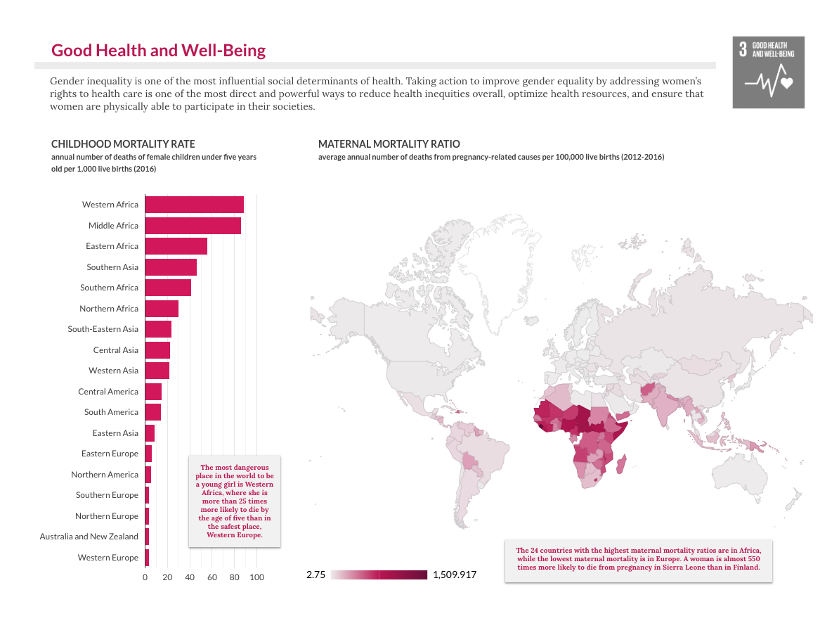
“In order to get inspiration for my story,” Jacobson said, “I first studied others’ research and analysis on gender equality and development. Then I turned to the data from the UN SDG Indicators dataset to identify and explore the indicators of health, education, and employment that included sex as a variable, in order to use these indicators as barometers of gender equality.”
Jacobson examined data from Rwanda, Bolivia, and Cuba, which are the three countries with the best performance on an indicator of gender equality that is fundamental to a country's social structure: political representation.
She found that achievement in gender equality in political representation in these three countries coexists with gains for women in health, education, and employment. “I believe that this is a hopeful sign,” Jacobson said, “that societal improvement in the physical, mental, and economic empowerment of women can enable them to achieve equality through their own efforts.”
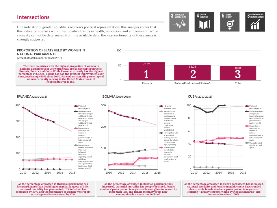
Through Jacobson’s research, she was surprised to learn how much Rwanda has overcome in the 25 years since it’s horrific genocide. “In many ways, it is now among the safest and most stable countries in the world,” she shared, “and perhaps not coincidentally — it leads the world in representation of women in parliament.” Though Jacobson describes herself as an avid consumer of news, she was not aware of how quickly and effectively Rwanda has developed, and she’s happy to share that success through her data story.
Prior to the competition, Jacobson wasn’t familiar with Google Data Studio, but she found it user-friendly and intuitive. “It includes a great tool for data exploration, which I used to determine which variables I wanted to use and what they could tell us. From there, it was just a classic design process — trying out lots of different things to see what communicated the information most clearly and appealingly.”
Jacobson shared that the MIDS program was instrumental to her success in this competition: “The exploratory data analysis techniques that I learned in W200 and W203 gave me everything I needed to work with this dataset. The critical thinking skills that I honed in W201 helped me to define and communicate the story I wanted to tell. And most importantly, being in MIDS has given me the confidence that I have what it takes to do this!”
As a Visualize 2030 contest winner, Jacobson received a $10,000 cash prize and publication and promotion by Google Cloud, including an announcement during the World Economic Forum at Davos.


