RYCH - Review-based Yelp Category Heatmap
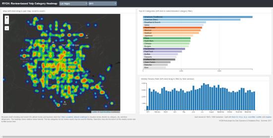
The motivation for our project was to facilitate exploratory data analysis on the Yelp reviews and business dataset in order to provide insight into potential business opportunities for restaurant owners, as well as show customers a geospatial representation of cuisines that are trending. We determined that a dashboard layout was most suitable for this task. Three types of visualizations were chosen to convey unique relationships across variables: (1) a map displaying review density versus location, (2) an ordered row-chart showing popular categories by number of reviews, and (3) a bar chart displaying weekly review rates over time. While Tableau offers a wide variety of options for plotting and data munging, we chose to use more web-native technologies to streamline our visualization and hopefully improve responsiveness. D3.js, dc.js, and crossfilter were used for importing and plotting data, along with linking category and time filters across the three visualizations. Leaflet was used for map display and drawing the heatmap layer, while mapbox facilitated custom styling of the OpenStreetMap maps. Dashboard templates for bootstrap were provided via Keen.IO.
In retrospect, the decision to use compressed JSON file storage limited the scope of our project, due to browser unresponsiveness and crashing while importing large datasets. An RDBMS backend which served only relevant data (e.g. by viewable lat-lon, top categories, or time) could relieve the storage and processing requirements on the browser/client-side. This could also provide a more suitable storage, aggregation and retrieval process for more real time review data, if such data was to be provided by Yelp.


