US Health Risks and Pollutants
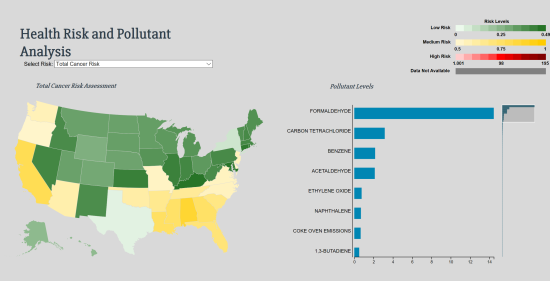
This is an interactive visualization allowing users to easily explore and gain actionable insights from US EPA pollutant and health risk data. Users select a health risk of interest and then explore the incidence of that risk at state or county levels by hovering over a chloropleth. Prevalence of pollutants are updated dynamically in a bar chart as the user hovers over geographies.
Alternatively, users can hover over a pollutant in the bar chart and see the levels of that pollutant dynamically displayed in the map.
The intended audience is the general public, researchers, regulators, and policy makers.
Data are from 2014.


