Covid 19 and Race Visualizations
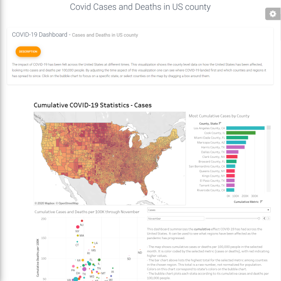
Our visualizations aim to call attention to the disparate impact COVID-19 has had in the United States based on race, socioeconomic factors, time, geography, and more. These charts are intended to inform viewers of what populations have been most affected by COVID-19 as the pandemic has progressed. The following dashboards examine what factors are associated with greater contagion and lethality of COVID-19. We hope this will provide useful context for those wishing to understand the impact of this pandemic in the United States more granularly.
This virus has been devastating for everyone in this country. This visualization shows which populations have been affected the most and what factors have been correlated with negative COVID-19 outcomes. It is important to remember that this data shows what has happened and what patterns have emerged. It does not predict what will happen, nor does it ascribe causality to these associated statistics.


