Occupation Trends in the USA
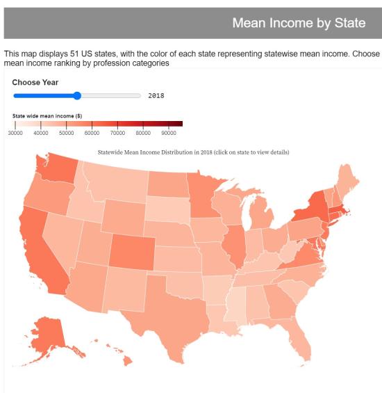
For our final project, we created a web page with three interactive visualizations showing occupation trends in the USA, from 2016-2020. Major occupation categories, along with average wage and number employed in each category is shown, broken down by state.
A line graph, choropleth, and treemap are used. D3 is used as it is powerful, and there are a lot of existing libraries of visualizations to use.


