A Better Fitness Data Dashboard
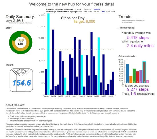
People purchase a wearable device like Apple Watch, Fitbit, or Garmin to track their health status and become a healthier person as a result. However, most often a good portion of these people end up not using the device as much as they had expected because the data tracking and visualization doesn’t appeal to the common person. Our team aimed to change that.
Using what we learned in w209 Data Visualization and Communitcation, we built a single page health-tracking dashboard that offers users insight into their steps-per-day patterns. Multiple rounds of user testing helped us create a design that is as intuitive, engaging, and interactive as possible. Uncovering patterns in your health data should not
mean having to run it in an excel sheet; our dashboard automatically compares performance to goals and highlights patterns and trends.


