COVID-19 Visualization
The goal of this project is to help health and government officials as well as the general public visualize and understand COVID-19 trends.
This project was initially structured around the following hypotheses:
- An increase in testing helps to reduce or slow down the number of positive cases.
- The vaccine helps reduce or slow down the spread of the virus, but the effect is different for the alpha and delta variants of COVID.
- The politicalization of COVID has caused case, death, hospitalization, and vaccination rates to depend on whether a state is more Republican or Democratic leaning.
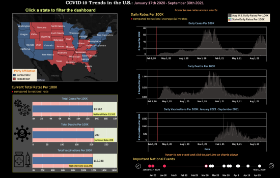
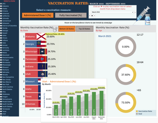
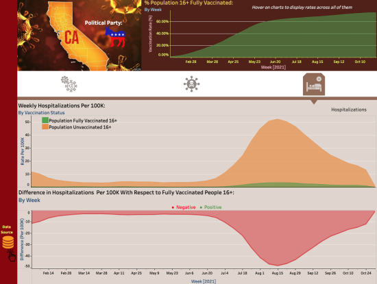
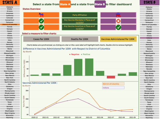
The final result is a set of 4 dashboards displaying:
- COVID-19 Trends in the US
- Vaccination Rates
- COVID-19 Trends in California
- State Comparison.
The data used for this project was sourced from:
- CDC
- AJMC
- CHH Open Data
- Kaggle
View the video demo to see this project in action, or visit the project link to try it yourself!


