Income Disparity Scale
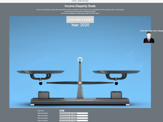
Our goal for this visualization is to create an interactive tool that allows users to compare the average wages of various occupations in a simplistic—and hopefully relatable—way, by placing icons that represent each profession on a balancing scale.
We envision this as an online tool that is potentially available to anyone with internet access, but our intent is for the design of this project to transform that availability into accessibility. The underlying data is already available to the general public, but in formats that can be difficult to find, organize, and decipher (as we’re learning through our exploratory analyses). Ironically, even when the numbers are side by side, the scope of income disparity can be so large that it may obscure its own significance; the limits of human comprehension can make the gross inequality seem abstract, so we want to express it in the simplest possible terms.


